Typography is a powerful tool in design, with the ability to shape how information is presented and perceived. As we move into 2023, it’s crucial to be aware of the latest typography trends while also recognizing what’s falling out of favor. In this blog post, we’ll explore the fonts that belong to both the hottest typography trends and those that are losing their appeal.
Trending Typography Styles
1. Variable Fonts
Variable fonts are a single font file that includes multiple styles within a single typeface. Designers can adjust attributes like weight, width, and slant, offering a high degree of flexibility.
‘Recursive’ is an excellent instance of a variable font. It provides a wide range of styles, from ultra-light to extra-bold, condensed to expanded, maintaining visual coherence.
2. Bold and Playful Serif
Bold and playful serif fonts combine traditional serif elements with a contemporary twist. These fonts feature thick and dramatic serifs, making them ideal for eye-catching headlines and logos.
‘Poppins’ is a prime example of this trend. It blends bold serifs with clean lines, offering a sense of contemporary elegance.
3. Retro and Vintage Vibes
Retro and vintage fonts draw inspiration from the past, invoking nostalgia and authenticity. They encompass classic script fonts and bold, blocky lettering reminiscent of mid-20th-century advertising.
‘Bebas Neue’ captures the essence of the 1970s with its bold, uppercase lettering, perfect for creating titles with a vintage flair.
4. Minimalist Sans-Serif Fonts
Minimalist sans-serif fonts are characterized by clean lines, simplicity, and readability. They are unobtrusive and convey a sense of modernity, making them suitable for a variety of applications.
‘Montserrat’ is a classic minimalist sans-serif font, renowned for its clean lines and geometric shapes.
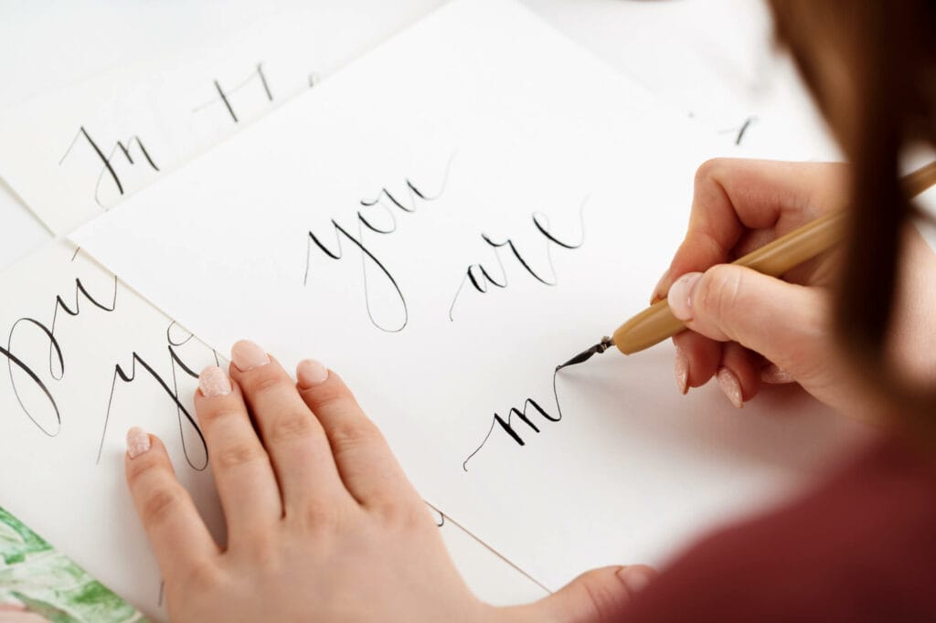
5. Handwritten and Custom Fonts
Handwritten and custom fonts add a personal touch that standard typefaces can’t replicate. They are popular for creating a unique and authentic brand identity.
The Coca-Cola logo features a custom handwritten font that’s synonymous with the brand, conveying warmth and individuality.
Falling Out of Favor
6. Overly Ornate Fonts (Not-So-Trend)
Overly ornate fonts are highly decorative and intricate, often challenging to read in larger blocks of text. They were popular in certain historical periods but are now less favored for mainstream use.
Fonts like ‘Copperplate’ are known for their excessive ornamentation, making them less suitable for modern design.
7. Clashing Font Combinations (Not so Trend)
Clashing font combinations occur when designers use fonts that don’t harmonize well together. This can result in chaotic and confusing visual experiences.
Pairing a fancy script font with an ultra-modern sans-serif font may create clashing font combinations, which can be visually jarring and hard to read.
As the design landscape evolves, so do typography trends. It’s essential to stay updated and understand when to embrace new trends and when to rely on timeless classics. Fonts have a significant impact on the overall aesthetics and effectiveness of your design. So, whether you’re creating a brand identity, a website, or any visual content, make thoughtful font choices that align with your goals and resonate with your audience.
Got Questions? We've Got Answers!
Got Questions?
We've Got Answers!
FAQ
Variable fonts are a single font file with multiple styles within one typeface. They allow designers to adjust attributes like weight, width, and slant, offering versatility and flexibility in typography design.
Certainly! ‘Poppins’ is a prime example of a bold and playful serif font, combining traditional serif elements with a contemporary twist, making it ideal for eye-catching headlines and logos.
Retro and vintage fonts draw inspiration from the past, invoking nostalgia and authenticity. They encompass classic script fonts and bold, blocky lettering reminiscent of mid-20th-century advertising, adding a vintage flair to designs.
‘Montserrat’ is a classic minimalist sans-serif font known for its clean lines, simplicity, and readability. It conveys a sense of modernity and is suitable for various design applications.
Handwritten and custom fonts add a personal touch that standard typefaces can’t replicate. They are popular for creating a unique and authentic brand identity, such as the Coca-Cola logo’s custom handwritten font.
Overly ornate fonts are intricate and decorative but can be challenging to read in larger blocks of text. They were popular in historical periods but are less favored for mainstream use due to their lack of readability and compatibility with contemporary design.
Clashing font combinations occur when designers use fonts that don’t harmonize well together, resulting in chaotic and confusing visual experiences. Designers should avoid them as they can be visually jarring and make text hard to read.
Staying updated with typography trends is crucial as the design landscape evolves. Typography significantly impacts the overall aesthetics and effectiveness of design. Knowing when to embrace new trends and when to rely on timeless classics is essential for successful design projects.
To make thoughtful font choices, consider your design goals and your target audience. Ensure that the selected fonts match the message you want to convey and the visual identity you want to establish. Experiment with font pairings and seek feedback to make informed decisions.

